When it comes to UI design, getting it right can make all the difference. Your users decide within seconds if your app or website feels easy and enjoyable—or confusing and frustrating.
But how do you create an interface that feels natural and keeps people coming back? The answer lies in following the best standards for UI design. These standards aren’t just rules; they’re proven ways to boost usability and make your designs shine.
Keep reading to discover the key principles that will transform your UI and help you connect with your users like never before.
Core Ui Design Principles
Designing user interfaces (UI) requires following core principles to create smooth, easy-to-use experiences. These principles guide designers to build interfaces that feel natural and clear. The best UI design standards focus on making every interaction simple and effective. Core UI design principles help maintain quality and usability across all screens and devices. They ensure users can complete tasks quickly without confusion or frustration. Understanding these fundamentals helps designers create interfaces that meet user needs and business goals.
Consistency Across Interfaces
Consistency means keeping design elements uniform across different parts of the interface. It helps users learn the system faster and feel confident using it. When buttons, colors, fonts, and icons remain consistent, users understand how to interact with the UI. Inconsistent design confuses and slows down task completion.
Key points for consistency:
- Use the same color scheme and typography across all pages.
- Keep navigation menus and buttons in the same place.
- Apply similar interaction patterns for similar tasks.
- Maintain consistent icon styles and sizes.
Here is a simple example table showing consistent vs. inconsistent UI elements:
| Aspect | Consistent UI | Inconsistent UI |
|---|---|---|
| Button Style | Same color, shape, and size on all pages | Different colors and sizes for similar buttons |
| Navigation | Menu always at the top with the same layout | The menu changes location and style on each page |
| Icons | Uniform icon style and meaning | Mixed icon styles and unclear meanings |
Consistent design builds trust and reduces errors. Users focus on content, not guessing how to use the interface.
Visual Hierarchy
Visual hierarchy organizes elements by importance. It guides users’ eyes to the most important parts first. A clear hierarchy makes the interface easier to scan and understand. Users find what they want without extra effort.
Designers create hierarchy using:
- Size: Larger elements attract more attention.
- Color: Bright or contrasting colors highlight key items.
- Position: Items placed at the top or center stand out more.
- Whitespace: Space around elements separates and groups content.
- Typography: Different font weights and styles signal importance.
Example of a simple visual hierarchy:
- Headline: Large, bold font to catch attention.
- Subheading: Smaller but still noticeable.
- Body text: Regular font for reading details.
- Call to action button: Bright color and clear label.
Visual hierarchy reduces cognitive load by making content clear. Users quickly know what to do and where to click.
User-centered Approach
User-centered design puts the user’s needs first. The UI must solve real problems and fit user abilities. Understanding the user’s goals, skills, and context is vital.
Steps to follow:
- Research: Study users through interviews, surveys, and observation.
- Personas: Create profiles representing typical users.
- Usability testing: Test prototypes with real users to find issues.
- Iterate: Improve designs based on user feedback.
Good user-centered design means:
- Simple, clear instructions and labels.
- Accessible for users with different abilities.
- Efficient task flows that minimize steps.
- Feedback to show system status and errors.
Building empathy with users creates better interfaces. It improves satisfaction, reduces frustration, and boosts success.
Typography And Color Choices
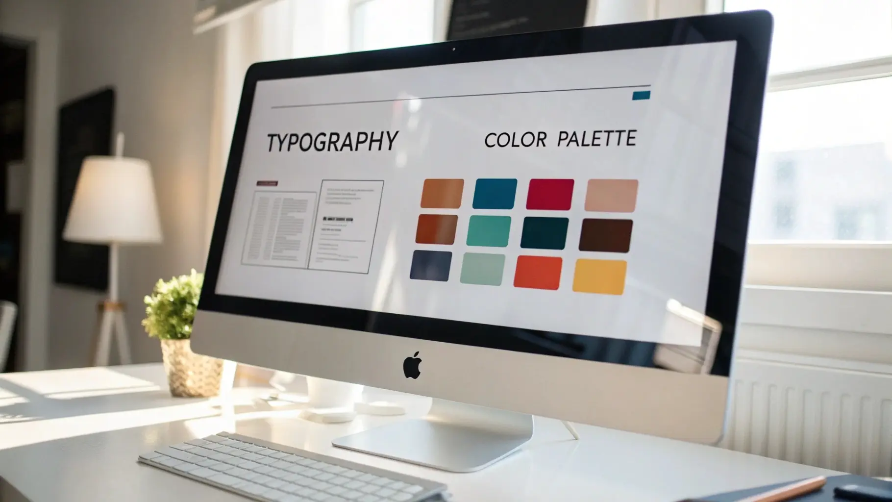 Typography and color choices form the foundation of effective UI design. They guide users through interfaces and create a clear visual hierarchy. Good typography ensures text is easy to read, while thoughtful color choices support brand identity and improve usability. Together, they enhance user experience and accessibility. Ignoring these elements can confuse and reduce engagement. Designers must balance creativity with clarity to deliver a seamless interface.
Readable Fonts
Readable fonts improve comprehension and reduce eye strain. Choose fonts that are clear and simple. Avoid overly decorative or complex styles for body text. Sans-serif fonts like Arial, Helvetica, and Roboto are popular for their clean appearance. Serif fonts, such as Times New Roman, work well for headings or printed materials.
Key points for readable fonts:
- Font size: Use at least 16px for body text.
- Line height: Keep it 1.5 times the font size for better spacing.
- Font weight: Use normal or medium weight to avoid blurring.
- Limit font families: Stick to 2-3 fonts per project for consistency.
| Font Type | Best Use | Example |
|---|---|---|
| Sans-serif | Body text, buttons, UI elements | Arial, Roboto, Helvetica |
| Serif | Headings, printed content | Times New Roman, Georgia |
| Monospace | Code snippets, technical data | Courier New, Consolas |
Use fonts that support multiple languages and special characters. Test your fonts on different screen sizes and devices. This ensures readability remains consistent everywhere.
Accessible Color Palettes
Accessible color palettes create a comfortable experience for all users. Choose colors that work well for people with color blindness or low vision. Avoid relying only on color to convey important information. Use patterns, shapes, or text labels alongside colors.
Tips for accessible palettes:
- Use color contrast checkers to meet WCAG standards.
- Limit the number of colors to 3-5 for simplicity.
- Choose colors with enough brightness difference.
- Test palettes in grayscale to verify clarity.
| Color | HEX Code | Usage | Accessibility Notes |
|---|---|---|---|
| Dark Blue | 003366 | Headings, links | Good contrast with a white background |
| Light Gray | CCCCCC | Backgrounds, borders | Neutral and easy on the eyes |
| Bright Orange | FF6600 | Buttons, highlights | Use sparingly to draw attention |
Use tools like Color Oracle or Coblis to simulate color blindness. This helps ensure your palette works for everyone. Consistency in color use also supports brand recognition and user trust.
Contrast And Legibility
High contrast improves legibility and helps users read content easily. Text must stand out clearly against backgrounds. Low contrast causes eye fatigue and confusion. Focus on contrast ratios that meet WCAG AA or AAA standards.
Important contrast guidelines:
- Text and background should have at least a 4.5:1 contrast ratio.
- Large text (18pt or 14pt bold) needs a minimum 3:1 ratio.
- Avoid using similar colors for text and backgrounds.
- Use tools like WebAIM Contrast Checker to verify ratios.
Example of contrast ratios:
| Text Color | Background Color | Contrast Ratio | WCAG Level |
|---|---|---|---|
| 000000 (Black) | FFFFFF (White) | 21:1 | AAA |
| 666666 (Gray) | FFFFFF (White) | 10.5:1 | AAA |
| 999999 (Light Gray) | FFFFFF (White) | 4.5:1 | AA |
| CCCCCC (Very Light Gray) | FFFFFF (White) | 1.5:1 | Fail |
Test your UI in different lighting conditions and screen types. This ensures text remains legible for all users. Keep designs simple and avoid clutter to maintain clarity.
Layout And Spacing
 Layout and spacing form the backbone of effective UI design. They organize content, guide users, and create a clean, attractive interface. Good layout ensures elements align neatly, while proper spacing prevents clutter and improves readability. Together, they help users find information quickly and enjoy a smooth experience. Understanding and applying the best standards in layout and spacing can make a big difference in how users interact with your design.
Grid Systems
Grid systems create a structured framework for UI design. They divide the screen into columns and rows to align elements consistently. Using grids helps maintain balance and harmony across the interface. Designers rely on grids to position text, images, buttons, and other components in a neat order.
Benefits of Grid Systems:
- Consistency: Keeps elements aligned and evenly spaced.
- Efficiency: Speeds up the design process by providing a clear guide.
- Scalability: Makes it easier to adapt layouts to different screen sizes.
Common grid types include:
| Grid Type | Description | Use Case |
|---|---|---|
| Column Grid | Divides layout into vertical columns | Web pages, mobile apps |
| Modular Grid | Rows and columns create blocks or modules | Dashboards, complex interfaces |
| Hierarchical Grid | Flexible grid based on content importance | Creative layouts, editorial designs |
Designers often use a 12-column grid for web UI. This divides the screen into 12 equal parts, making it easy to create varied layouts. Grids also help place elements in a logical order, improving user flow.
Whitespace Usage
Whitespace, also called negative space, is the empty area between elements. It does not mean wasted space. Whitespace improves clarity and focus. It separates sections, making content easier to scan and understand.
Key points about whitespace:
- Increases readability: Text blocks with spaces are easier to read.
- Enhances visual hierarchy: Helps highlight important elements.
- Creates balance: Prevents overcrowding and chaos.
Whitespace comes in different forms:
- Margins: Space outside elements.
- Padding: Space inside elements, between content and border.
- Line spacing: Space between lines of text.
Proper use of whitespace leads to:
- Less eye strain
- Improved comprehension
- Cleaner and more professional look
Too little whitespace makes interfaces feel cramped and confusing. Too much whitespace may waste screen space on small devices. Balance is key.
Responsive Design
Responsive design ensures UI layouts adapt smoothly to different screen sizes. It uses flexible grids and spacing to maintain usability on desktops, tablets, and smartphones. This approach avoids zooming or horizontal scrolling.
Important aspects of responsive layout and spacing:
- Fluid grids: Layout columns use percentages, not fixed pixels.
- Flexible images: Images resize within their containers.
- Adaptive spacing: Margins and padding adjust for smaller screens.
Designers test responsiveness by:
- Resizing browser windows
- Using device emulators
- Checking on real devices
Responsive design improves:
- User experience across devices
- Accessibility for all users
- SEO rankings, as search engines prefer mobile-friendly sites
Overall, responsive layout and spacing ensure your design looks good and functions well everywhere.
Navigation And Interaction
 Effective navigation and interaction are the backbone of great UI design. They guide users smoothly through an app or website. Clear navigation helps users find information fast. Interaction makes the experience engaging and intuitive. Together, they reduce confusion and improve satisfaction. Designers must focus on simplicity and clarity. This section covers the best standards for navigation and interaction in UI design.
Clear Navigation Paths
Clear navigation paths make it easy for users to move through a site or app. Users should always know where they are and where to go next. Navigation must be simple and logical. Avoid complex menus or too many choices at once. Use familiar patterns like top menus, sidebars, or hamburger icons for mobile.
Key points for clear navigation paths:
- Consistent placement: Keep navigation in the same spot on all pages.
- Descriptive labels: Use clear, simple words for menu items.
- Visual hierarchy: Highlight important links with size or color.
- Breadcrumbs: Show users their current location within the site.
- Limit options: Too many choices cause confusion and slow decisions.
Here is a simple table to compare good and bad navigation practices:
| Good Navigation | Bad Navigation |
|---|---|
| Menu placed at the top or the side | The menu changes position on every page |
| Labels like “Home,” “About,” “Contact” | Labels like “Stuff,” “Things,” “Other” |
| Breadcrumbs show the current page | No way to track location |
| Limited and grouped options | Too many scattered links |
Interactive Feedback
Interactive feedback helps users understand what is happening after they take an action. Without feedback, users may feel lost or think the system is broken. Feedback can be visual, audio, or tactile. It confirms actions like clicks, form submissions, or errors.
Important types of feedback include:
- Hover effects: Change button color or style when the mouse is over it.
- Click animations: Show a small animation when a button is pressed.
- Loading indicators: Display spinners or progress bars during waits.
- Error messages: Clearly explain what went wrong and how to fix it.
- Success messages: Confirm that an action finished correctly.
Use feedback consistently to build trust and keep users informed. Avoid too many flashy effects that distract or slow down the interface.
Touch Targets And Accessibility
Touch targets are the areas users tap on mobile or touch devices. They must be large enough to prevent mistakes. Small targets cause frustration and errors. Accessibility ensures that everyone, including users with disabilities, can use the interface easily.
Best practices for touch targets and accessibility:
- Minimum size: Make touch targets at least 44×44 pixels or 7-10mm.
- Spacing: Add enough space between targets to avoid accidental taps.
- Clear labels: Use readable text and icons with sufficient contrast.
- Keyboard navigation: Ensure users can navigate using a keyboard.
- Screen readers: Provide proper ARIA labels and semantic HTML.
The table below shows size recommendations for touch targets:
| Device | Recommended Touch Target Size |
|---|---|
| Mobile phones | 44×44 pixels (approx. 7-10mm) |
| Tablets | 48×48 pixels or larger |
| Desktop (touch screens) | 44×44 pixels minimum |
Applying these standards improves usability and makes designs inclusive for all users.
Performance And Accessibility
 Performance and accessibility are key pillars of effective UI design. A fast, accessible interface ensures all users can interact smoothly and efficiently with your product. These elements improve user satisfaction and broaden your reach to include people with disabilities. Prioritizing performance and accessibility creates a better, more inclusive experience for everyone.
Load Times Optimization
Fast load times keep users engaged and reduce bounce rates. Slow interfaces frustrate users and drive them away. Optimizing load times means your UI appears quickly and responds without delay. This is crucial for retaining users and improving overall usability.
Use these best practices for load time optimization:
- Minimize HTTP requests: Combine files like CSS and JavaScript to reduce server calls.
- Compress images: Use formats like WebP and apply compression tools to reduce size.
- Lazy load content: Load images and resources only when they enter the viewport.
- Enable browser caching: Store static resources locally to speed up repeat visits.
- Optimize code: Remove unused CSS and JavaScript to reduce file size.
| Technique | Impact on Load Time | Implementation |
|---|---|---|
| Minimize HTTP requests | Reduces server calls, faster page load | Combine CSS and JS files |
| Image compression | Decreases file size, faster image loading | Use WebP, compress tools |
| Lazy loading | Loads content only when needed | Implement with JavaScript or native HTML |
| Browser caching | Speeds up repeat visits | Set cache headers in the server |
Regularly test your UI with tools like Google PageSpeed Insights or Lighthouse. These tools offer suggestions to improve load times. Keep file sizes small and scripts efficient to maintain fast performance.
Screen Reader Compatibility
Screen readers help users with visual impairments navigate your UI. Designing for screen reader compatibility ensures your interface is usable by everyone. It requires clear, semantic HTML and thoughtful labeling.
Key guidelines include:
- Use semantic HTML elements: Tags like,, , anddefine structure.
- Provide alt text for images: Describe images clearly for screen readers.
- Label form fields: Use tags linked to inputs with the
forattribute. - Use ARIA roles and properties: Add extra meaning where native HTML is insufficient.
- Keep content order logical: Ensure screen readers read content in the correct sequence.
Example of proper form labeling:
Email:Testing with screen readers like NVDA or VoiceOver helps identify accessibility issues. Clear headings, landmarks, and descriptions make navigation easier for all users.
Keyboard Navigation
Many users rely on keyboards instead of a mouse. Effective keyboard navigation lets users move through your UI easily. It supports users with motor disabilities and power users who prefer keyboards.
Best practices for keyboard navigation include:
- Ensure all interactive elements are focusable: Links, buttons, and form fields must receive keyboard focus.
- Use a visible focus indicator: Highlight focused elements clearly, such as with an outline.
- Maintain logical tab order: The Tab key should move through elements in a natural sequence.
- Support keyboard shortcuts: Provide shortcuts for common actions when possible.
- Avoid keyboard traps: Users should never get stuck on an element.
Example CSS for focus outline:
button:focus, a:focus { outline: 2px solid 005fcc; outline-offset: 2px; } Test your UI using only the keyboard. Navigate through menus, forms, and dialogs to ensure smooth operation. Proper keyboard support makes your UI accessible and efficient for all users.
Popular Ui Design Frameworks
Choosing the right UI design framework shapes how users interact with your product. Popular UI design frameworks offer clear guidelines and ready-made components. These frameworks help designers create interfaces that look good and work well across devices. They also maintain consistency, improving user experience and reducing design time. Three widely used frameworks stand out: Material Design, Human Interface Guidelines, and Fluent Design System. Each has unique features and follows specific principles that suit different platforms and audiences.
Material Design
Material Design is a design system developed by Google. It focuses on creating clean, bold, and intuitive interfaces. The design mimics real-world materials like paper and ink, using shadows and layers to show depth. This makes the UI feel tactile and easy to understand.
Material Design uses a grid-based layout, responsive animations, and padding to create balance and harmony. It supports vibrant colors and bold typography, enhancing readability and user engagement.
- Key principles: Material surfaces, meaningful motion, bold graphic design
- Components: Buttons, cards, dialogs, sliders, and more
- Benefits: Consistent across Android, web, and iOS
| Feature | Description |
|---|---|
| Elevation | Uses shadows to create a sense of hierarchy and depth |
| Color System | Supports primary, secondary, and accent colors with accessibility in mind |
| Typography | Clear and readable fonts like Roboto and Noto |
Material Design is ideal for apps needing a modern, clean look with strong visual cues. It works well on multiple screen sizes and devices, making it a popular choice for developers and designers worldwide.
Human Interface Guidelines
Human Interface Guidelines (HIG) are Apple’s official design rules for iOS, macOS, watchOS, and tvOS apps. The goal is to create seamless, simple, and familiar experiences for Apple users. HIG focuses on clarity, deference, and depth.
Clarity means text and controls are easy to read and understand. Deference means the interface stays out of the way to highlight content. Depth adds layers and visual effects to create a sense of hierarchy.
- Core principles: Aesthetic integrity, consistency, direct manipulation
- Design focus: Intuitive gestures, natural animations, and fluid transitions
- Platform integration: Uses native UI elements like buttons, pickers, and sliders
Apple provides extensive resources for adapting designs to different screen sizes and orientations. The guidelines emphasize touch targets, legible text sizes, and adaptive layouts.
| Aspect | Details |
|---|---|
| Navigation | Simple and clear navigation bars with back buttons |
| Typography | San Francisco font optimized for readability on Apple devices |
| Animation | Smooth and subtle to enhance user interaction |
HIG helps designers create apps that feel natural on Apple devices. It supports a strong brand identity while ensuring usability and accessibility for all users.
Fluent Design System
Fluent Design System is Microsoft’s design language for Windows and cross-platform apps. It aims to create engaging, flexible, and immersive experiences. The system uses light, depth, motion, material, and scale as its five key elements.
Light guides user attention and shows interactive areas. Depth uses layers and shadows to separate content. Motion adds smooth transitions to make interactions feel natural. Material applies textures and transparency. Scale adjusts UI elements for different screen sizes.
- Key components: Acrylic material (transparency), Reveal highlight (hover effects), Connected animations.
- Design goals: Accessibility, adaptability, and coherence across devices
- Use cases: Desktop apps, UWP apps, and Microsoft 365 tools
| Element | Function |
|---|---|
| Light | Focuses user attention and adds depth |
| Motion | Creates smooth transitions and feedback |
| Material | Uses textures and transparency for layering |
| Scale | Adjusts UI for various screen sizes |
Fluent Design encourages flexible layouts and responsive controls. It delivers a consistent experience on Windows devices and beyond. Designers benefit from a rich toolkit to build modern, elegant interfaces.
Frequently Asked Questions
What Are The Core Principles Of Ui Design Standards?
Core UI design principles include consistency, simplicity, clarity, and feedback. These ensure intuitive, user-friendly interfaces that enhance user experience and reduce errors. Following these principles helps create visually appealing and functional designs that meet user needs effectively.
How Do Ui Design Standards Improve User Experience?
UI design standards provide uniformity, making interfaces predictable and easy to navigate. This reduces user confusion and increases satisfaction. Consistent design elements build trust and improve usability, leading to better engagement and lower bounce rates on digital platforms.
Which Tools Support Adherence To Ui Design Standards?
Popular tools like Figma, Sketch, and Adobe XD help designers maintain UI standards. They offer reusable components, style guides, and collaboration features. These tools streamline design workflows and ensure consistency across projects, improving overall design quality and efficiency.
Why Is Accessibility Important In Ui Design Standards?
Accessibility ensures interfaces are usable by people with disabilities. It broadens the audience and complies with legal requirements. Designing for accessibility improves usability for all users, enhancing inclusivity and creating a positive brand image.
Conclusion
Good UI design follows clear and simple rules. It makes websites easy to use and look nice. Consistent colors, fonts, and layouts help users feel comfortable. Clear buttons and fast loading keep visitors happy. Testing and feedback improve the design over time.
Stick to these standards for a better user experience. Your users will thank you for it. Keep learning and updating your skills. Good design is a key to success.