Are you ready to make your website stand out in 2026? Web design is changing fast, and knowing the latest trends can give you a big advantage.
Imagine your site catching attention the moment someone visits, keeping them hooked, and turning clicks into loyal customers. You’ll discover the top web design trends that will shape how your audience sees and interacts with your brand. Keep reading to learn how to create a website that feels fresh, easy to use, and impossible to ignore.
Minimalist Interfaces
Web design trends in 2026 show a clear move toward minimalist interfaces. This style focuses on clean UI design and simplicity in web design. Websites use fewer elements but work more efficiently. The goal is to create uncluttered interfaces that feel fresh and easy to use. This approach helps visitors find information quickly and enjoy a smooth experience. Minimal web layouts and flat UI patterns shape this trend, making pages look modern and neat. Modern minimalism is not just about less content, but about better focus and usability.
Whitespace Usage
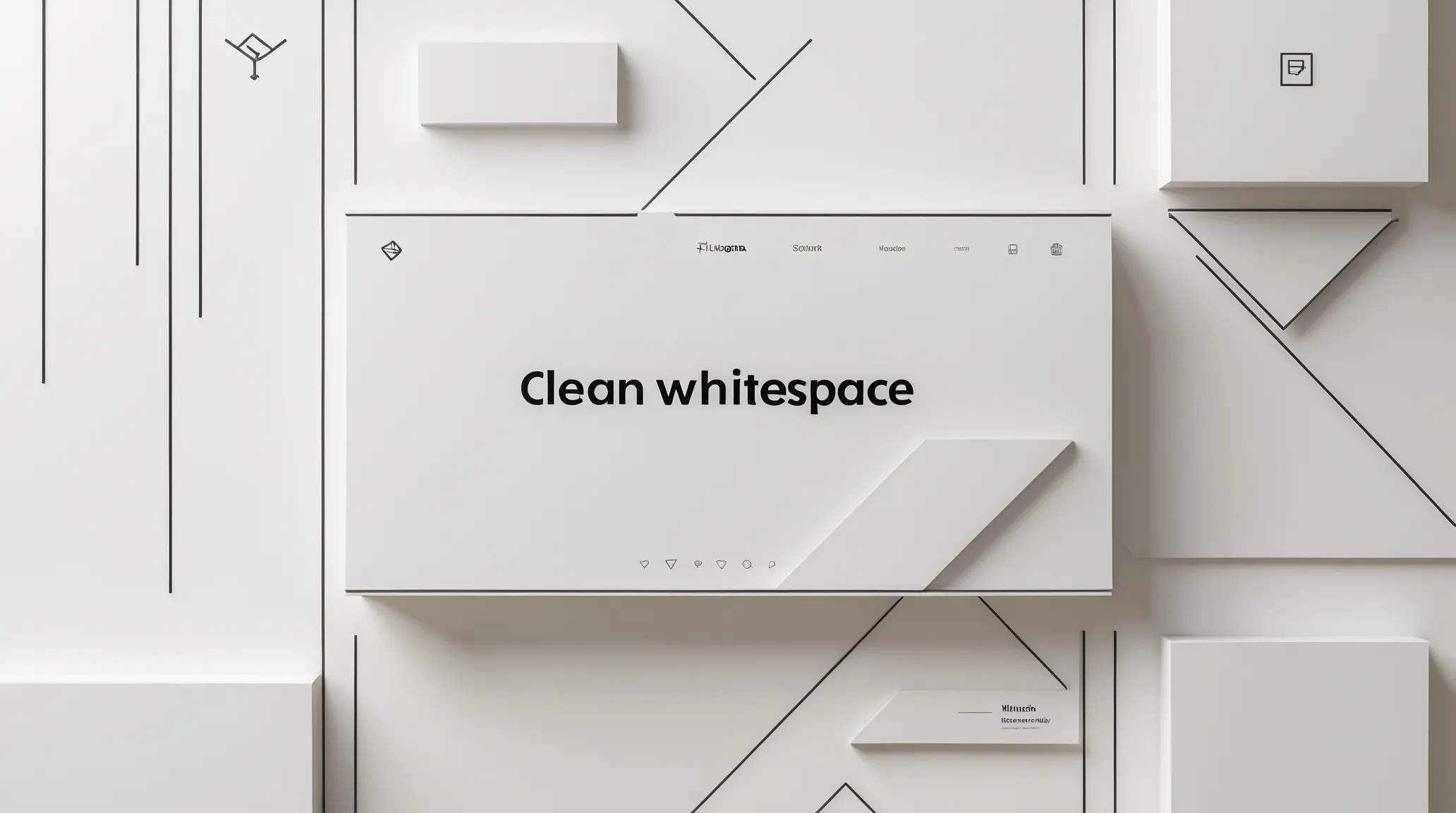
Whitespace is one of the most important parts of modern minimalism. It means leaving space between text, images, and buttons. This space helps the eye rest and focus on what matters.
Good use of whitespace creates a sense of balance and order. It stops the page from feeling crowded or confusing. Websites with clean UI design use whitespace to guide users naturally through the content.
- Improves readability by separating text blocks
- Makes buttons and links easier to find
- Highlights important elements without extra decoration
- Supports minimal web layouts by reducing noise
Here is a simple comparison:
| With Whitespace | Without Whitespace |
|---|---|
| Clean, easy to scan | Busy, hard to read |
| Focus on key messages | Messages lost in clutter |
| Calm and inviting | Overwhelming and stressful |
Using whitespace well is a key part of uncluttered interfaces. It supports user focus and makes websites feel more professional.
Simplified Navigation
Simplified navigation is another trend in minimalist interfaces. It means fewer menu items and clearer paths to find content. Users do not waste time searching for what they want.
Flat UI patterns help simplify navigation by keeping menus simple and clean. Icons replace long text labels. Dropdowns and sidebars appear only when needed.
Benefits of simplified navigation include:
- Faster access to important pages
- Less confusion and fewer clicks
- Better experience on mobile devices
- Supports clean UI design and minimal web layouts
Examples of simplified navigation:
- Hamburger menus on small screens
- Sticky headers with limited links
- Breadcrumb trails for clear user paths
- Search bars with predictive text
Clear navigation supports simplicity in web design. It creates uncluttered interfaces that guide users smoothly through the site.
Soft Color Palettes
Soft color palettes are popular in minimalist interfaces. These palettes use gentle, muted colors that do not distract users. They create a calm, welcoming feeling.
Colors often include pastels, light grays, and soft blues. These shades support clean UI design and do not compete with the content. They work well with minimal web layouts by keeping pages simple but attractive.
Advantages of soft color palettes:
- Reduces eye strain for longer visits
- Enhances the readability of text and buttons
- Creates a modern, elegant look
- Works well with flat UI patterns and minimalism
Example soft palette:
| Color | Hex Code | Use |
|---|---|---|
| Soft Blue | A3C4F3 | Backgrounds, highlights |
| Light Gray | E8E8E8 | Sections, borders |
| Pastel Pink | F7D6D0 | Buttons, accents |
| Warm Beige | F5F1E9 | Page backgrounds |
Soft color palettes blend with whitespace to keep the site feeling open. They help maintain the focus on content and usability.
Dark Mode Dominance
Dark mode dominance is shaping web design trends in 2026. More websites adopt dark UI themes to improve user comfort and reduce eye strain. This style also saves battery life on devices with AMOLED screens. The rise of dark mode reflects a shift towards creating a night-friendly interface. Designers focus on contrast optimization and dark mode accessibility to make content easy to read in low-light environments. The trend changes how users interact with websites and how designers build them.
User Preferences
Users prefer dark UI themes for many reasons. Many find dark backgrounds easier on the eyes during night use or in dim rooms. It reduces glare and helps with focus. Studies show users spend more time on sites with dark mode options.
- Eye comfort: Dark mode lowers eye strain in low-light user experience.
- Battery saving: AMOLED-friendly design saves power on mobile devices.
- Visual appeal: Dark themes look modern and sleek to many users.
Surveys reveal that around 70% of users switch to dark mode when available. Some users prefer to toggle between light and dark modes depending on the time of day or environment.
| User Benefit | Impact |
|---|---|
| Reduced Eye Strain | Improves comfort during extended reading |
| Battery Efficiency | Extends device usage, especially on AMOLED screens |
| Better Focus | Limits distractions from bright backgrounds |
Design Challenges
Creating dark UI themes presents unique design challenges. Not all colors work well on dark backgrounds. Designers must carefully select colors for contrast optimization. Poor choices can make text hard to read and reduce accessibility.
Designers face these issues:
- Color balance: Avoid harsh contrasts that cause eye fatigue.
- Readability: Ensure text remains clear and legible.
- Consistency: Maintain brand identity while adapting to dark mode.
Dark mode accessibility requires testing with different devices and lighting conditions. AMOLED-friendly design helps reduce screen burn-in but demands careful color use. Designers also must consider how interactive elements look and behave in dark mode.
Example:
/ Example CSS for contrast optimization / body { background-color: 121212; / Dark background / color: E0E0E0; / Light text / } a { color: BB86FC; / Accent color for links / } Adaptive Color Schemes
Adaptive color schemes adjust automatically to user settings and environment. They create a seamless experience between light and dark modes. This approach enhances the night-friendly interface by shifting colors based on ambient light or time of day.
Key features of adaptive schemes include:
- Dynamic color changes: Shift colors smoothly between modes.
- Contrast optimization: Keep text readable in all conditions.
- User control: Allow toggling or automatic switching.
Adaptive designs improve dark mode accessibility by responding to user needs. They support AMOLED-friendly design goals by minimizing power use during dark mode. This makes websites more comfortable and efficient for users.
| Feature | Benefit |
|---|---|
| Automatic Mode Switching | Adjusts display based on time or light |
| Customizable Colors | Users can personalize their appearance |
| Consistent Branding | Maintains brand look in all modes |
3d Elements And Depth
 Web design trends in 2026 focus heavily on 3D elements and depth. These features bring websites to life, making them more engaging and easier to navigate. Designers use 3D web graphics and depth-based UI to create realistic and interactive experiences. This trend moves beyond flat design, adding layers and motion that draw users into the content. The use of WebGL animation helps deliver smooth, fast, and interactive visuals. These techniques improve how visitors explore websites and interact with elements on the page.
Interactive Animations
Interactive animations are a key part of 3D web design in 2026. They respond to user actions, creating a dynamic experience that feels alive. With interactive 3D elements, users can click, drag, or hover to trigger animations. This involvement makes the website memorable and fun to use.
Benefits of interactive animations include:
- Improved user engagement by encouraging exploration
- Clearer communication through visual feedback
- Enhanced storytelling with motion-enhanced UX
- Reduced bounce rates as visitors stay longer
For example, product pages use animations to show different angles or features. Navigation menus can expand or morph smoothly using WebGL animation. This adds a tactile feel to digital interactions.
| Animation Type | User Interaction | Effect on UX |
|---|---|---|
| Hover-triggered | Mouse hover | Instant visual feedback |
| Click-based | Click or tap | Deeper content reveal |
| Scroll-activated | Page scrolling | Smooth content transition |
Realistic Textures
Realistic textures add a tactile feel to digital designs. They create depth and material-like surfaces on websites. Using 3D web graphics, designers simulate wood, metal, fabric, and more. This technique makes visuals richer and more believable.
Textures improve user experience by:
- Giving a sense of touch through sight
- Enhancing the perception of depth-based UI
- Making interfaces look less flat and more natural
- Supporting brand identity with unique visual styles
Common texture types include:
- Matte and glossy finishes
- Rough or smooth surfaces
- Patterns like fabric weave or stone grain
Realistic textures work well with lighting effects to enhance layered interface design. When combined with shadows and highlights, they create a three-dimensional feel that invites users to explore.
Immersive Visual Layers
Immersive visual layers use multiple overlapping elements to build depth. This approach relies on layered interface design and motion to guide attention. Layers move at different speeds or directions, creating a parallax effect that feels natural.
Key features of immersive visual layers include:
- Multiple content layers that interact visually
- Depth cues through shadows, blur, and scaling
- Enhanced focus on important elements
- Improved storytelling by controlling visual flow
These layers work with motion-enhanced UX to keep users engaged. They also help separate information clearly, avoiding clutter. Designers use this technique in landing pages, portfolios, and product showcases.
Example structure of a layered interface:
Background contentMain content
Interactive 3D elements
The layers can move independently with WebGL animation, creating a smooth and immersive experience. This depth-based UI style makes websites feel modern and alive.
Ai-powered Personalization
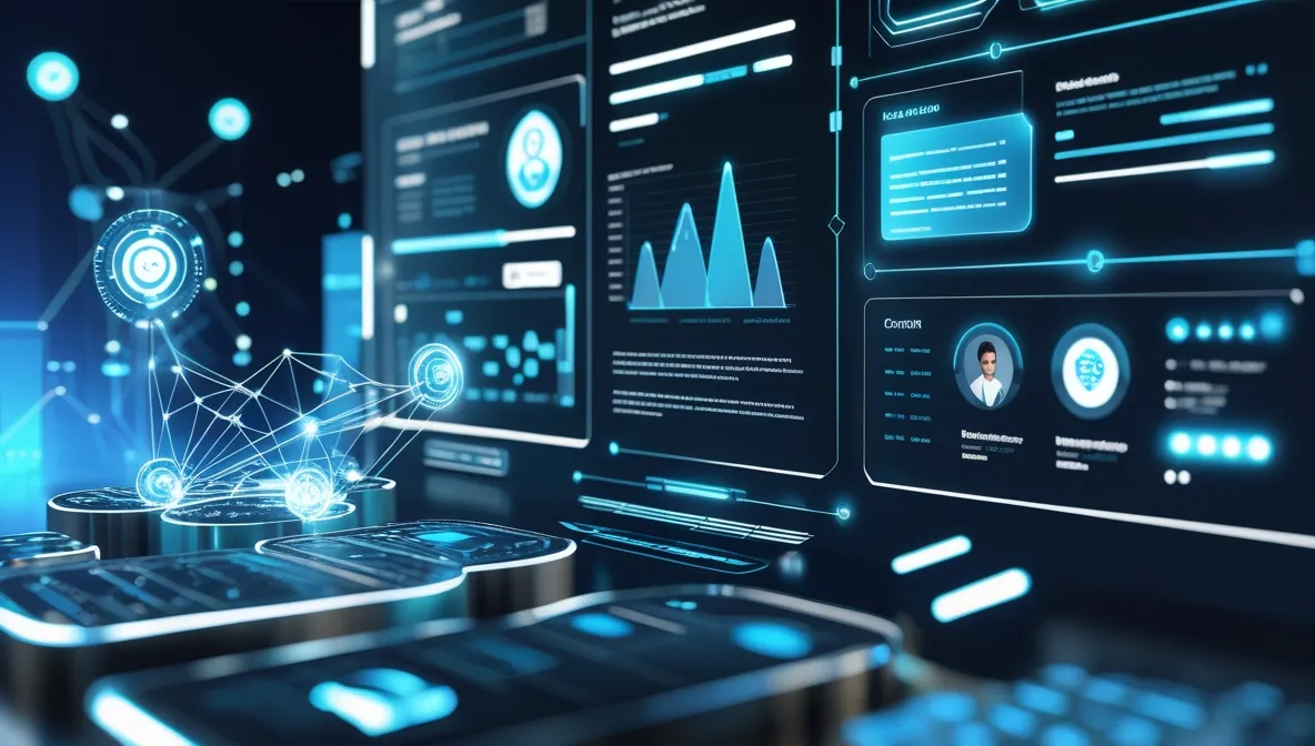 AI-Powered Personalization is a major trend shaping web design in 2026. Websites now use AI-driven UX to create unique experiences for each visitor. This personalization helps websites adapt in real time, making users feel understood and engaged. The rise of personalization algorithms allows sites to change content based on user preferences and behavior automatically. This trend changes how designers think about building websites, focusing on flexible, intelligent systems rather than static pages.
Dynamic Content
Dynamic content means website elements change based on who is visiting and their past interactions. With adaptive website content, AI can show different images, text, or offers to different users without manual updates. This method increases user engagement and satisfaction because content feels relevant and timely.
Examples of dynamic content include:
- Product recommendations based on browsing history
- Personalized greetings or messages
- Location-specific information and promotions
- Content that adapts to device type or time of day
Using personalization algorithms, websites can automatically select which content to display. This helps in presenting exactly what users want or need, improving conversion rates.
| Dynamic Content Type | Example | Benefit |
|---|---|---|
| Product Suggestions | Showing related items after purchase | Increases sales and average order value |
| Personalized News | Articles based on reading habits | Boosts user retention and time on site |
| Location-Based Offers | Discounts for local stores | Improves relevance and user satisfaction |
User Behavior Analysis
AI tools track and analyze how users interact with a website. This machine learning in design helps designers understand which parts of a site work well and which do not. User behavior analysis reveals patterns such as click paths, time spent on pages, and preferred content types.
Key points of user behavior analysis include:
- Collecting data from user actions
- Using AI to find trends and preferences
- Adapting website layout and content accordingly
Websites use this data to improve navigation, reduce bounce rates, and increase engagement. AI recommendation systems leverage these insights to tailor experiences further, showing users content that matches their interests.
Here is a simple example of data collected and its impact:
| User Action | Insight | Design Change |
|---|---|---|
| Many users leave on checkout page | The checkout process is too long | Shorten checkout steps |
| High clicks on the blog section | Users want more articles | Add related blog links on the homepage |
| Low interaction on mobile | Mobile design is not user-friendly | Optimize UI for mobile devices |
Predictive Design Experiences
Predictive web interfaces use AI to guess what users need next. This approach creates smoother and faster website experiences. AI analyzes past actions to predict future behavior, making the site one step ahead of the user.
Key features of predictive design include:
- Suggesting next pages or products
- Auto-filling forms based on user data
- Adjusting layouts to highlight popular content
Using predictive web interfaces, designers can build sites that feel intuitive and personalized without extra effort from users. These experiences reduce frustration and improve satisfaction.
Benefits of predictive design in a quick view:
| Feature | Effect |
|---|---|
| Next-page suggestions | Keeps users engaged longer |
| Auto-fill forms | Speeds up interactions |
| Content highlight | Focuses attention on valuable info |
Voice User Interfaces
Web design trends in 2026 focus heavily on voice user interfaces (VUI). These interfaces allow users to interact with websites using their voice. The rise of smart speakers and voice assistants drives this trend. Voice-first design is becoming essential for modern websites. It improves accessibility and user experience by enabling natural language interaction. Designers now prioritize VUI integration to create voice-enabled websites that feel intuitive and fast.
Voice Search Integration
Voice search integration is a key feature in voice user interfaces. Users speak their queries instead of typing them. This shift demands new ways to optimize content for spoken questions. Voice search uses conversational language, so websites must adapt to this style. Keywords become longer and more natural, matching how people talk.
Key points for effective voice search integration:
- Use natural language keywords: Short, robotic phrases no longer work well.
- Answer common questions clearly: Provide simple, direct answers to frequent queries.
- Structure content: Use lists, tables, and bullet points for easy comprehension.
Example table for voice search content:
| Question | Answer | Content Format |
|---|---|---|
| How to reset my password? | Click “Forgot Password” and follow instructions. | Step-by-step list |
| What are your business hours? | We are open Monday to Friday, 9 AM to 6 PM. | Short paragraph |
Integrating voice search improves site reach and user satisfaction. It also enhances voice navigation UX, helping users find information faster.
Hands-free Navigation
Hands-free navigation allows users to explore websites using only their voice. This speech interface reduces the need for clicks and taps. Voice navigation UX focuses on simple commands to move through pages or access features. It is especially helpful for users with disabilities or those multitasking.
Effective hands-free navigation includes:
- Clear voice commands: Commands must be easy to remember and use.
- Feedback sounds or messages: Confirm actions to avoid confusion.
- Context awareness: The system understands where the user is on the site.
Example voice commands for navigation:
- “Go to homepage.”
- “Open product details”
- “Scroll down”
- “Show contact information.”
Hands-free navigation supports accessibility and speeds up user tasks. It also aligns with voice-first design principles, making websites more natural to use.
Conversational Ui Patterns
Conversational UI patterns create more natural interactions between users and websites. These patterns mimic human conversation and use natural language interaction. VUI integration involves designing speech flows that feel friendly and helpful. Chatbots and virtual assistants often use conversational UI.
Important aspects of conversational UI:
- Context retention: The system remembers previous user inputs.
- Guided prompts: Users get suggestions to keep the conversation going.
- Error handling: The interface gracefully manages misunderstandings.
Sample conversational flow:
User: "Show me laptops under $1000." System: "Here are some options. Would you like to filter by brand or screen size?" User: "Filter by screen size, please." System: "What screen size do you prefer? 13 inches, 15 inches, or 17 inches?" Conversational UI patterns enhance user engagement and satisfaction. They make voice-enabled websites feel more personal and responsive.
Sustainable Design Practices
Web design trends in 2026 focus heavily on sustainable design practices. These practices aim to reduce the environmental impact of websites. Many designers now use green web practices to create carbon-efficient websites. Sustainable web design means building sites that consume less energy and use resources wisely. This approach helps protect the planet while still offering excellent user experiences. Simple changes can make a big difference in reducing a website’s carbon footprint.
Eco-friendly Hosting
Choosing the right hosting service plays a key role in sustainable web design. Renewable hosting uses energy from renewable sources like wind or solar power. This reduces the carbon emissions caused by traditional data centers.
Benefits of eco-friendly hosting include:
- Lower energy consumption
- Reduced greenhouse gas emissions
- Support for renewable energy projects
- Improved website reliability
Many hosting providers now offer green plans. They invest in carbon offset programs or run data centers with energy-efficient technology. Small businesses and large companies can choose eco-friendly hosting to show their commitment to the environment.
| Hosting Type | Energy Source | Carbon Impact | Cost |
|---|---|---|---|
| Traditional Hosting | Non-renewable | High | Low |
| Eco-Friendly Hosting | Renewable | Low | Moderate |
Energy-efficient Graphics
Graphics impact website energy use more than most realize. Large images and videos increase load time and energy consumption. Sustainable web design favors lightweight UI elements and optimized visuals. These reduce the power needed to display content.
Tips for energy-efficient graphics:
- Use compressed image formats like WebP or SVG
- Limit animations and auto-playing videos
- Choose simple colors and designs
- Use vector graphics instead of bitmaps
These methods lower data transfer and reduce server strain. It benefits mobile users and those with slow internet. Eco-friendly digital design makes websites faster and less energy-hungry.
| Graphic Type | File Size | Energy Use | Best Use |
|---|---|---|---|
| JPEG/PNG | Large | High | Photos |
| WebP/SVG | Small | Low | Icons, logos |
Low-carbon Web Performance
Improving web performance reduces energy use and carbon emissions. Carbon-efficient websites load faster and need less power. Sustainable web design focuses on optimizing code and server responses to cut waste.
Key strategies for low-carbon web performance:
- Minimize CSS and JavaScript files
- Use caching to reduce server requests
- Implement lazy loading for images and videos
- Choose fast, reliable content delivery networks (CDNs)
These steps make websites run smoothly on any device. They reduce the energy needed to access content and lower overall carbon footprints. Low-carbon web performance is vital for eco-friendly digital design in 2026.
Bold Typography
Web design trends in 2026 emphasize bold typography as a key element to capture attention and improve readability. Bold typography uses strong, clear, and striking text styles to make messages stand out. It enhances user experience by guiding the eye and creating a visual impact. This trend includes modern typography techniques that combine creativity with usability.
Custom Fonts
Custom fonts play a vital role in bold typography for web design. Designers use variable fonts to create text that adjusts smoothly in weight, width, and style. These fonts reduce website load time and allow more design flexibility. Custom fonts add uniqueness and match the brand’s voice perfectly.
Benefits of using custom fonts:
- Brand identity: Unique fonts distinguish a site from competitors.
- Performance: Variable fonts load faster than multiple font files.
- Flexibility: Designers can tweak font weight and style on the fly.
- Accessibility: Clear custom fonts improve readability for all users.
| Font Type | Advantages | Use Case |
|---|---|---|
| Variable Fonts | Fast loading, flexible styles | Responsive websites |
| Handcrafted Custom Fonts | Unique branding, expressive design | Brand logos, headlines |
Integrating custom fonts enhances typographic hierarchy. This guides visitors through content smoothly. Bold type treatments combined with custom fonts create dynamic, memorable designs.
Expressive Text Layouts
Expressive text layouts break traditional grids to add personality. This style emphasizes expressive type design by playing with spacing, size, and alignment. It creates a bold, artistic look that draws attention.
Key features of expressive text layouts include:
- Asymmetry: Text placed off-center or unevenly for visual interest.
- Overlapping: Layers of text and images that interact.
- Dynamic spacing: Varied space between letters and lines.
- Text shapes: Arranging words in curves or unusual forms.
These techniques help establish a strong typographic hierarchy by making important text larger or more colorful. Designers use futuristic fonts to add a modern, cutting-edge feel to layouts. Expressive layouts improve the user’s focus and create an emotional connection.
Here’s an example of how expressive layouts guide readers:
- Headline: Large and bold to capture attention.
- Subheading: Smaller but clear to explain the headline.
- Body text: Simple and readable for details.
High-contrast Headlines
High-contrast headlines are essential in bold typography for immediate impact. Contrast means using colors, sizes, or weights that clearly separate the headline from other text. This technique improves readability and draws the eye quickly.
Effective high-contrast headlines use:
- Dark text on light backgrounds or vice versa.
- Bold type treatments, such as thick strokes or shadows.
- Large font sizes combined with smaller body text.
- Futuristic fonts with sharp edges or unique shapes.
High contrast supports modern typography principles by emphasizing key messages. Designers create a clear typographic hierarchy using these headlines. It helps users find important info faster and improves overall design clarity.
| Contrast Type | Purpose | Example |
|---|---|---|
| Color Contrast | Separate headline from background | White text on black |
| Size Contrast | Highlight headline importance | 48px headline, 16px body |
| Weight Contrast | Make the headline bold and strong | Bold headline, regular body |
Using high-contrast headlines enhances user engagement. It also fits the 2026 trend for clean, bold, and modern web design.
Micro-interactions
Web design trends in 2026 focus heavily on micro-interactions. These are small, subtle animations and effects that happen when users interact with a website. They improve user experience by making digital interactions feel more natural and responsive. Micro-interactions include UI micro-animations, interactive feedback, and other small-scale UX effects that guide users smoothly through a site. These tiny details create a sense of connection between users and the interface. Designers use them to make digital experiences more engaging and enjoyable.
Feedback Animations
Feedback animations offer immediate responses to user actions. They confirm that an action has been recognized by the system. For example, when a button is clicked, a subtle animation might show the press or release. This type of interactive feedback reduces confusion and builds trust.
Common uses of feedback animations include:
- Button press effects
- Loading spinners or progress bars
- Form field validation animations
- Notification pop-ups
These animations are part of micro UX design. They help users understand the system’s state and what to expect next. Below is a table showing popular feedback animation types and their purposes:
| Animation Type | Purpose | Example |
|---|---|---|
| Button Ripple | Shows button press | Material Design ripple effect |
| Loading Spinner | Indicates loading process | Spinning circle |
| Shake Animation | Signals invalid input | Shaking the form field |
In 2026, feedback animations are smoother and less distracting. They blend naturally with the design and support dynamic user interaction.
Engagement Boosters
Engagement boosters are micro-interactions designed to keep users interested. They invite users to interact more deeply with content. These small effects encourage users to explore, click, or share.
Examples of engagement boosters include:
- Hover animations that reveal extra info
- Animated icons or buttons
- Micro-animations that reward user actions
- Interactive checklists or progress trackers
These effects increase user attention and satisfaction. They make websites feel alive and responsive. Designers use motion-based prompts to guide users gently toward actions. This improves conversions and user retention.
Engagement boosters also include:
- Visual cues that highlight clickable areas
- Micro UX design elements that celebrate achievements
- Dynamic user interaction triggers based on scroll or clicks
Such features create a sense of reward and accomplishment. Users spend more time on the site and interact more deeply with the content.
Subtle Motion Cues
Subtle motion cues are gentle animations that guide users without overwhelming them. These small movements draw attention to important elements. They improve navigation and usability.
Examples include:
- Slow fades on buttons or images
- Soft slide-ins of text or menus
- Gentle bouncing or pulsing of icons
These cues rely on small-scale UX effects that feel natural and unobtrusive. They enhance UI micro-animations by making interfaces more intuitive. Motion cues also signal changes or updates without interrupting the user.
Designers use these cues to:
- Direct focus on new or important content
- Help users understand the interface hierarchy
- Smooth transitions between states
Subtle motion cues support micro UX design principles by improving clarity and flow. They create a polished feel and add depth to the user experience.
Frequently Asked Questions
What Are The Top Web Design Trends In 2026?
The top web design trends in 2026 include AI-driven interfaces, immersive 3D visuals, voice navigation, and minimalistic layouts. These trends focus on enhancing user experience, accessibility, and faster loading times, making websites more engaging and efficient across devices.
How Does AI Influence Web Design In 2026?
AI enhances web design by automating personalization, optimizing layouts, and improving user interactions. It helps create adaptive interfaces that respond to user behavior, making websites smarter and more intuitive while reducing design time and errors.
Why Is Minimalism Important In 2026 Web Design?
Minimalism improves website speed, clarity, and user focus in 2026. It removes clutter, highlights essential content, and provides a clean aesthetic. This approach enhances usability and accessibility, ensuring visitors find information quickly and enjoy a seamless browsing experience.
Are 3d Elements Essential For 2026 Websites?
3D elements create immersive and interactive experiences, making websites more engaging in 2026. They help brands stand out and communicate complex ideas visually. However, they must be optimized to avoid slowing down site performance on various devices.
Conclusion
Web design in 2026 focuses on clean and simple styles. Bright colors and bold fonts catch visitors’ eyes quickly. Mobile-friendly sites remain a top priority for all designers. Animations and interactive elements create a fun user experience. Fast loading times keep users from leaving early.
Personalization helps websites feel more welcoming and useful. Staying updated with these trends can improve your site’s look and function. Keep designs clear and easy to navigate. The future of web design is creative and user-centered.